· Web
Werk aan herstel
A new brand and landing page for a return-to-work practice, built to speak to the employer as the client. Sharpening the proposition, branding, photography, and the design and development of the page.
- Client
- Werk aan herstel
- Role
- Proposition, copy, branding, photography & web development
Introduction
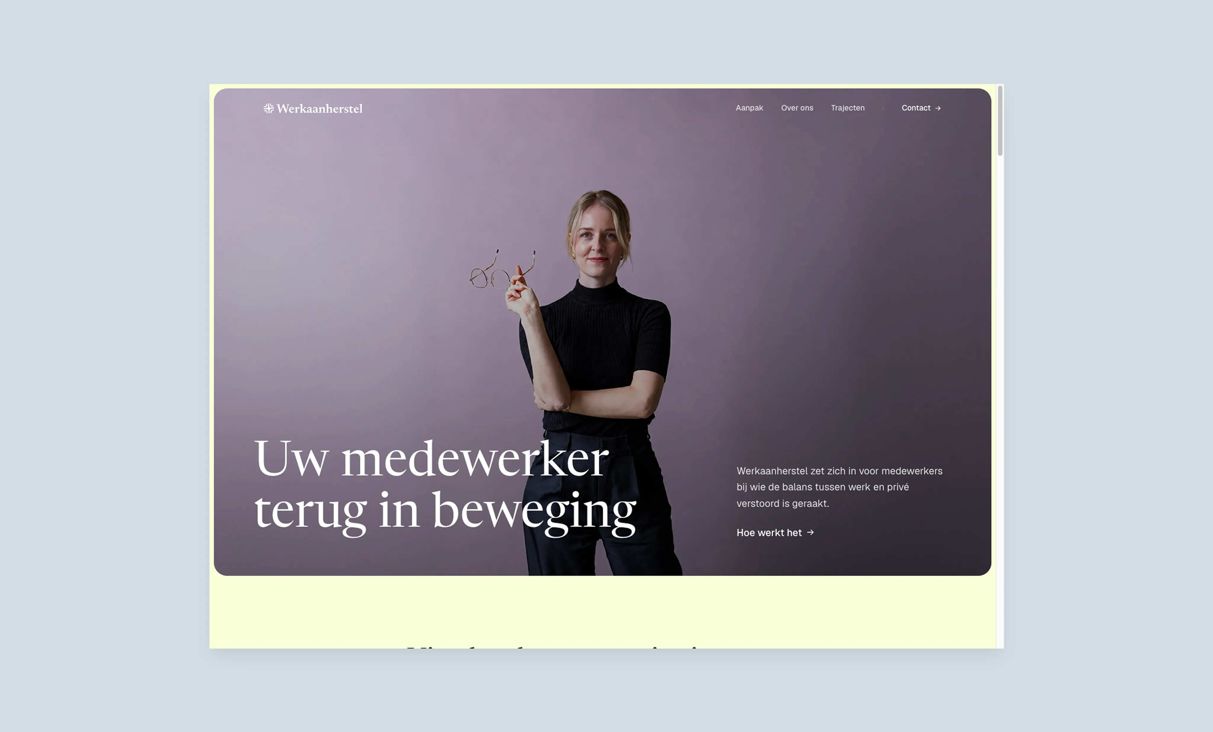
Werk aan herstel is the second practice of healthcare psychologist Anne de Kroon, focused on the return to work of employees on long-term sick leave. Unlike her existing practice, where clients are referred through their family doctor, this site speaks to the employer as the client. An entirely different audience, with different concerns, a different vocabulary, and a different decision moment.
My role covered the full project: from sharpening the proposition and the copy, to branding and photography, to the design and development of the landing page.
Problem
The expertise and experience were already there, the proposition was not. Anne had been working with people on sick leave for years, but had never positioned herself around the employer’s problem. The brief: build a proposition that lands with small and medium business owners on their own concerns, like work piling up, colleagues carrying more than they can handle, and an absence with no end in sight, and invites them into a conversation.
Building the proposition from scratch
The project did not start with design, it started with the proposition. In a copy proposal I showed, section by section, what a small or medium business owner needs to read in order to recognise themselves, and how Anne’s clinical work could be concretely tied to that. Only once that structure was in place did the design begin.
In weekly sessions we sharpened the copy and the design together, always testing the same thing: would an owner who just heard one of their employees is calling in sick recognise themselves here?
Designing for recognition and clarity
A few questions shaped the work:
- How do you make sure a small or medium business owner immediately recognises themselves, without pity and without medical jargon?
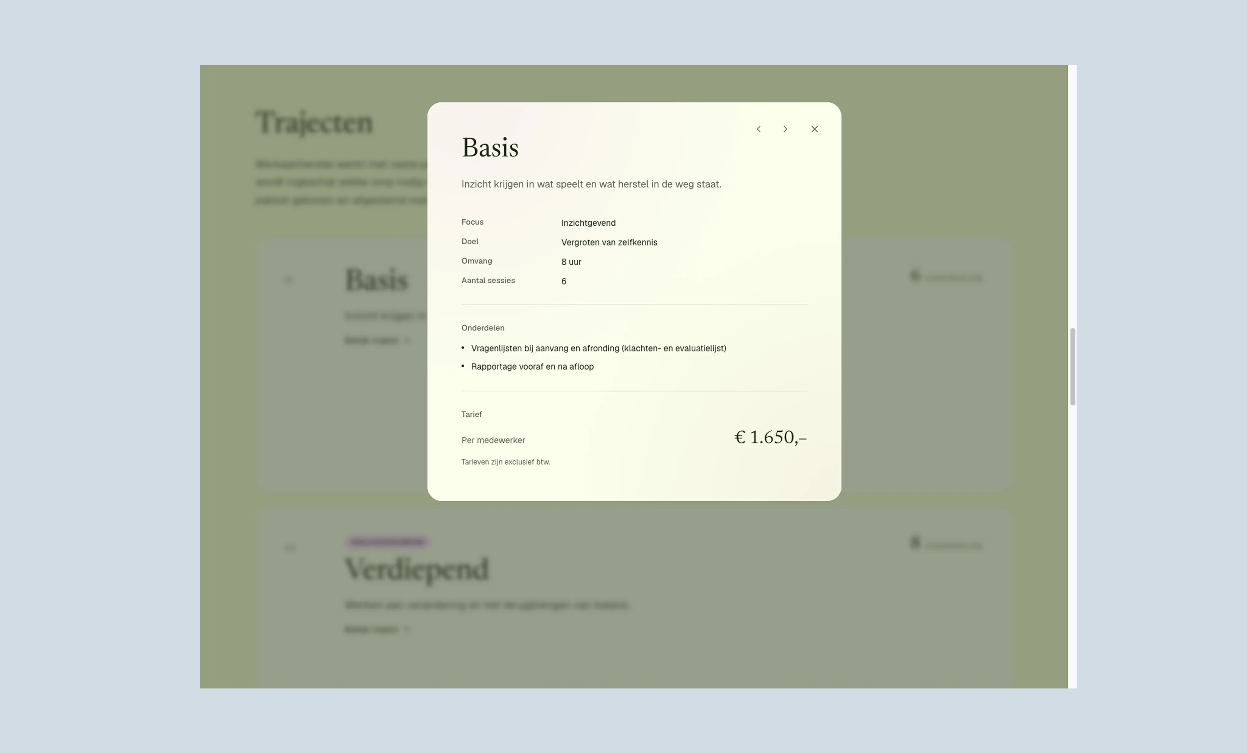
- How do you present four trajectories so the visitor gets an overview, without drowning in details that belong in a conversation?
- How do you introduce Anne personally without the site becoming a personal practice site, a second brand with its own tone?
The landing page
The one-pager is built around six sections, in an order that establishes recognition and trust before the offer comes into view:
- Hero: opening message that immediately establishes who the site is for and what Werk aan herstel does.
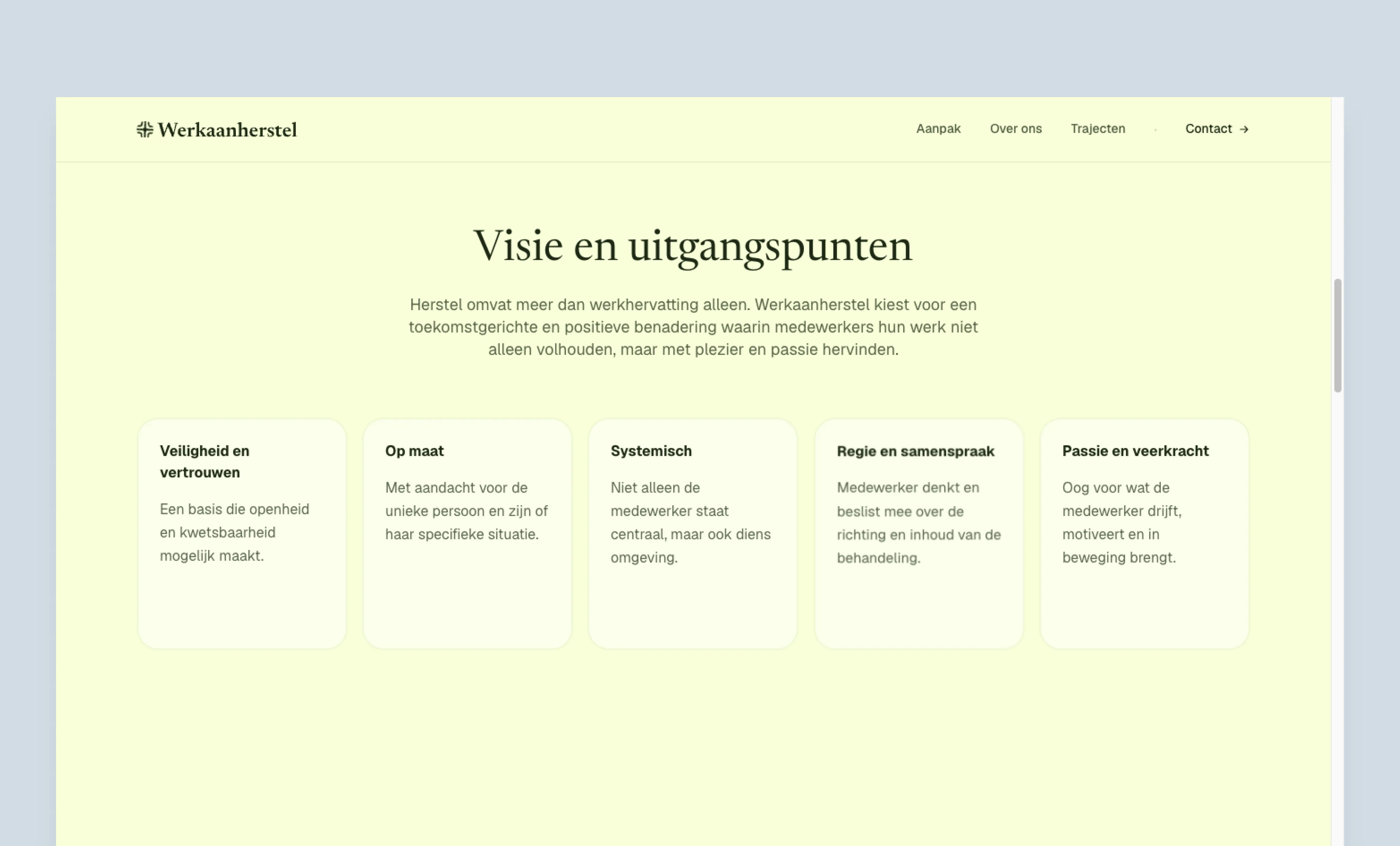
- Recognition: the organisational disruption caused by an absence. This is where the owner should think: this is about me.
- Approach: Anne’s way of working, concretely translated from her clinical field.
- About Anne: a personal introduction in first person, keeping her own warm, distinctive tone.
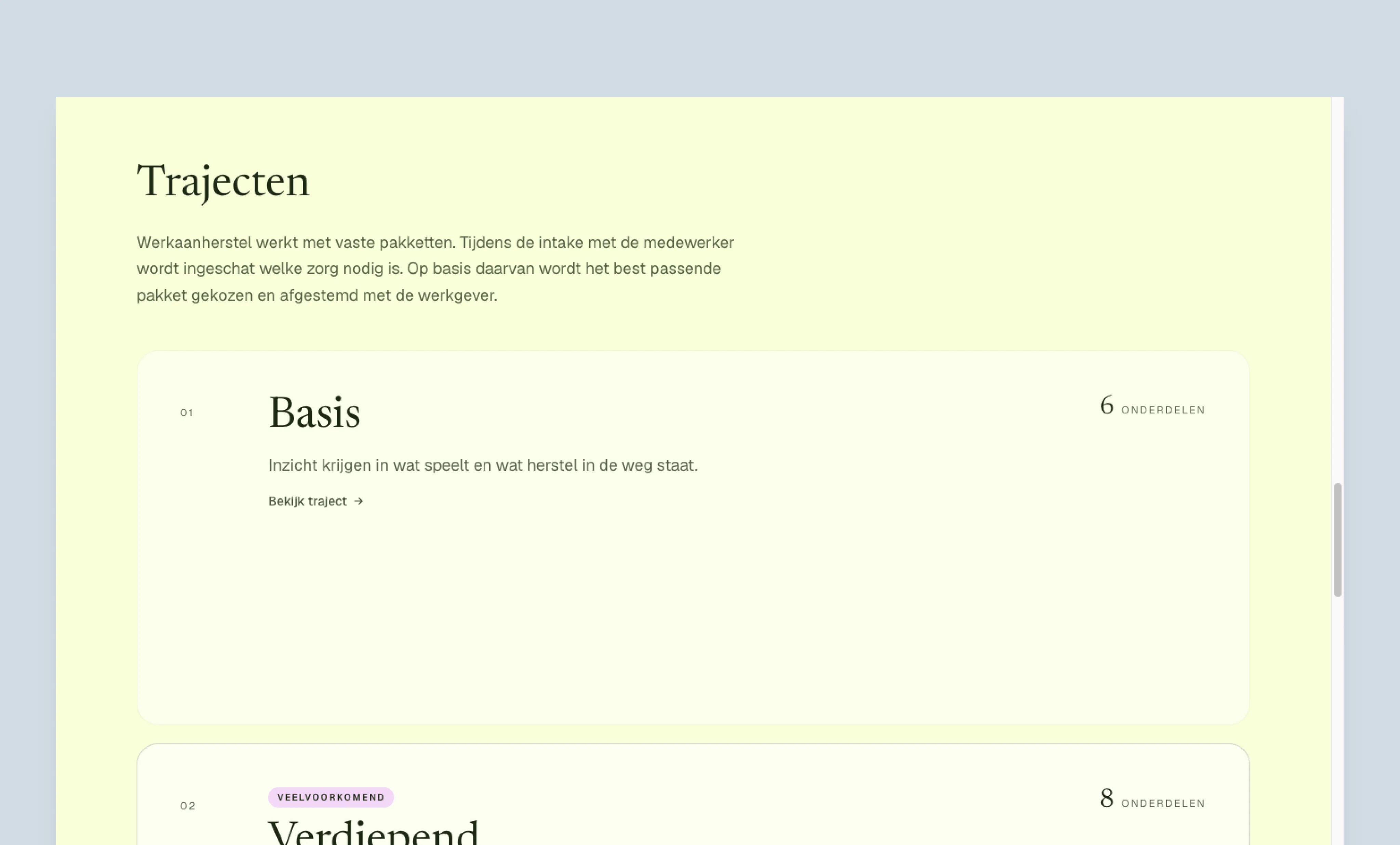
- Packages: four trajectories presented as equals, with only what is needed to make the process tangible.
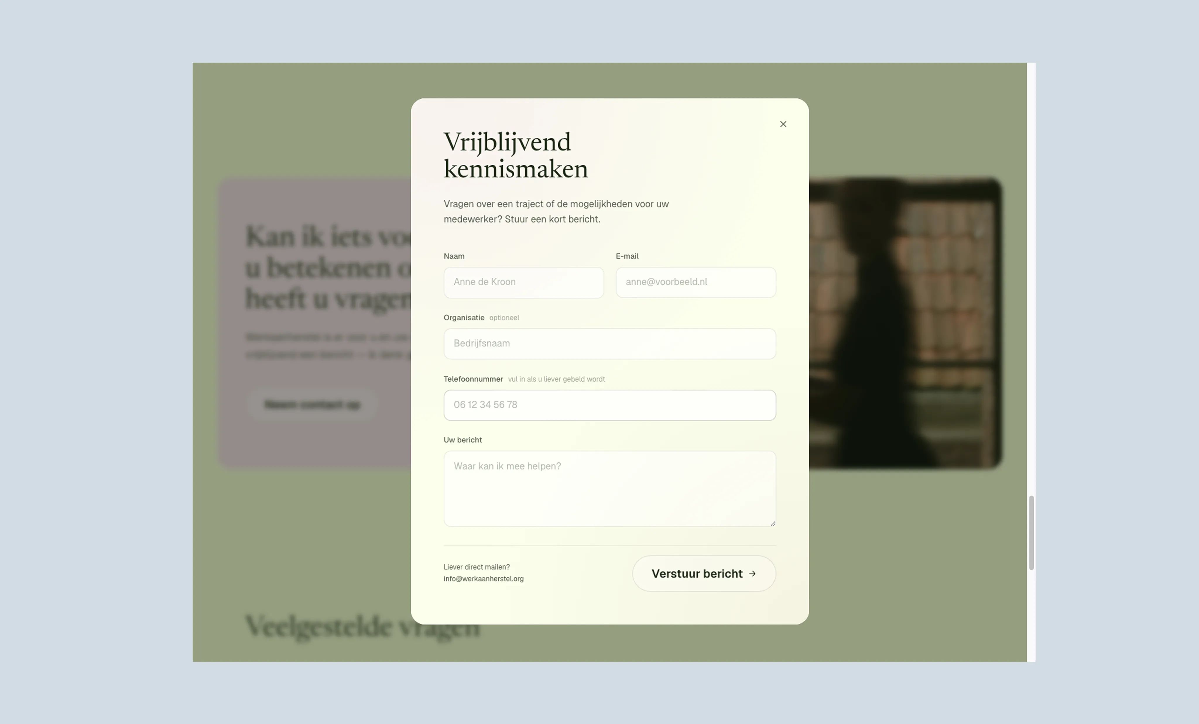
- Contact: a short inviting line followed by a contact form.
The site was built entirely custom, developed with AI-assisted coding rather than a CMS or platforms like Framer or Webflow. That approach gives full design freedom and keeps recurring costs low, which suits a one-pager that does not need constant updates.
Key takeaways
Structure over style. The biggest decision was the order of the page, not how it looked. I did not take the copy as a given. Anne and I thought the structure of the story through together, in conversation, instead of running with the first version without questioning it. The original plan put the packages right after the hero, which turns the offer into a choice without context. Putting recognition and vision first lets the page build trust before the commercial question comes up.
Language is positioning. For specialist services, the vocabulary is the real design decision. Jargon creates distance, even when the content is exactly right. The hard part was keeping Anne’s clinical depth while making every sentence readable for a business owner.
Leave things out. The source material was extensive: session formats, questionnaires, reporting cycles, methodology. That level of detail belongs in an intake or a proposal, not on a landing page. Cutting back felt like underdelivering at first, but the page only needs to start a conversation, not win the choice.
The website conveys exactly what I set out to express. Pieter sets himself apart through his creativity and his unerring sense of how to best reach and speak to people. I would recommend him to anyone.
Curious how it turned out? Take a look at werkaanherstel.org (opens in new tab).